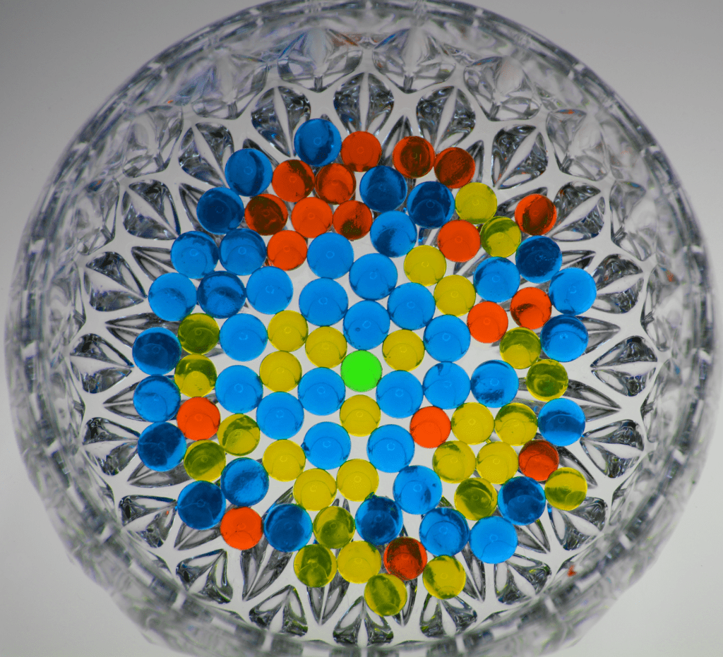
Beads
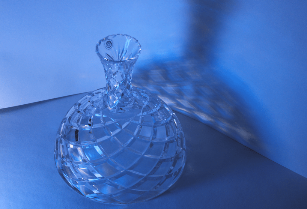
Shadow
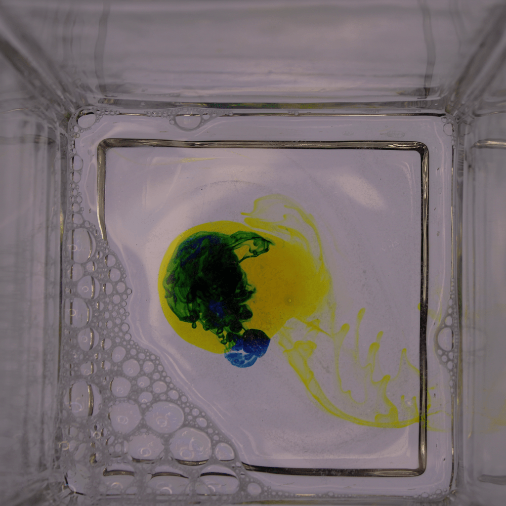
oil and water
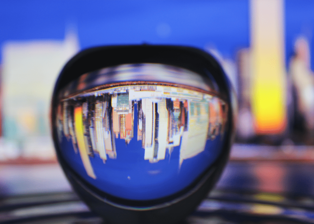
Refraction
Shadow
What is the distinct mood of the photograph?
It’s more so a light to dark. I love the color blue, more specifically a darker blue. It just looks good to me.
What does the photo make you think about?
It makes me think about the different shades of blue. I like the light and darker blues because it reminds me of winter and I love winter time. The photo gives me a cool, relaxed feeling.
What in the photo jumps out at you?
The different variety of blues is one thing that jumps out to me. Another thing is the angle the picture is taken at. This is because it shows the shadow a one of the focus points other than the vase.
How does the photo make you feel?
The photo makes me relaxed. The shades of blue relaxes my eyes. Overall, I like the picture a lot.
What advice would you give to next year’s students for shooting abstract photography?
There are a couple things I’d say to them. The first thing is to get creative, step outside the box and get pictures of anything. Another thing I would say is to take pictures constantly, take a lot of pictures because one thing may look good in one pic but it may look better in another one.
I just love the photo. Many things in it that I love. I love how clear the photo is. I thought the photo was really nice. I think one thing that can be fixed is the little bit of blurry. Around the apple it is a little blurry and there are ways to fix that. I think make sure your lens is clean. Also make sure the pic is clean. The effort is amazing too.
Something I liked: The picture is okay, but what is interesting is how the viewer can see the two colors forming into green. The photo otherwise is boring and the photographer should have waited for the colors to enlarge and have the colors mix. It is captivating since it is dark and has both yellow and dark green, having light and dark in the photo.
Something I thought could be better: The photographer should have been patient with the color mixing. If he had waited, I believe the picture would have been more interesting and more captivating. The photographer did a mediocre job and mixed the colors to make it better.
Advice: Be patient. Although it may take a while for the colors to mix, the final product will be better than what they took. Not a very good photo.
My favorite thing about the photo is where the blue and yellow mix and create green. This looks like he put 3 colors when he actually put 2. I think he could’ve mixed them a little more for c a better photo.
I think that he maybe could have mixed them to create a pattern. I think if he did this he would have made his photo 10x better. Other than this it was a good photo.
I would say to make cooler designs that intrigue the people that look at the photo. I would also say to move the bubbles because they are just staying in the corner. Other then that it’s a good photo.