
Man made line
Natural line

Geometric shape
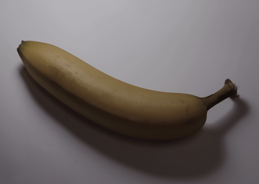
Organic shape
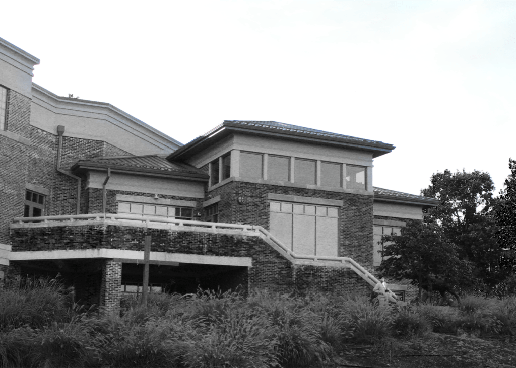
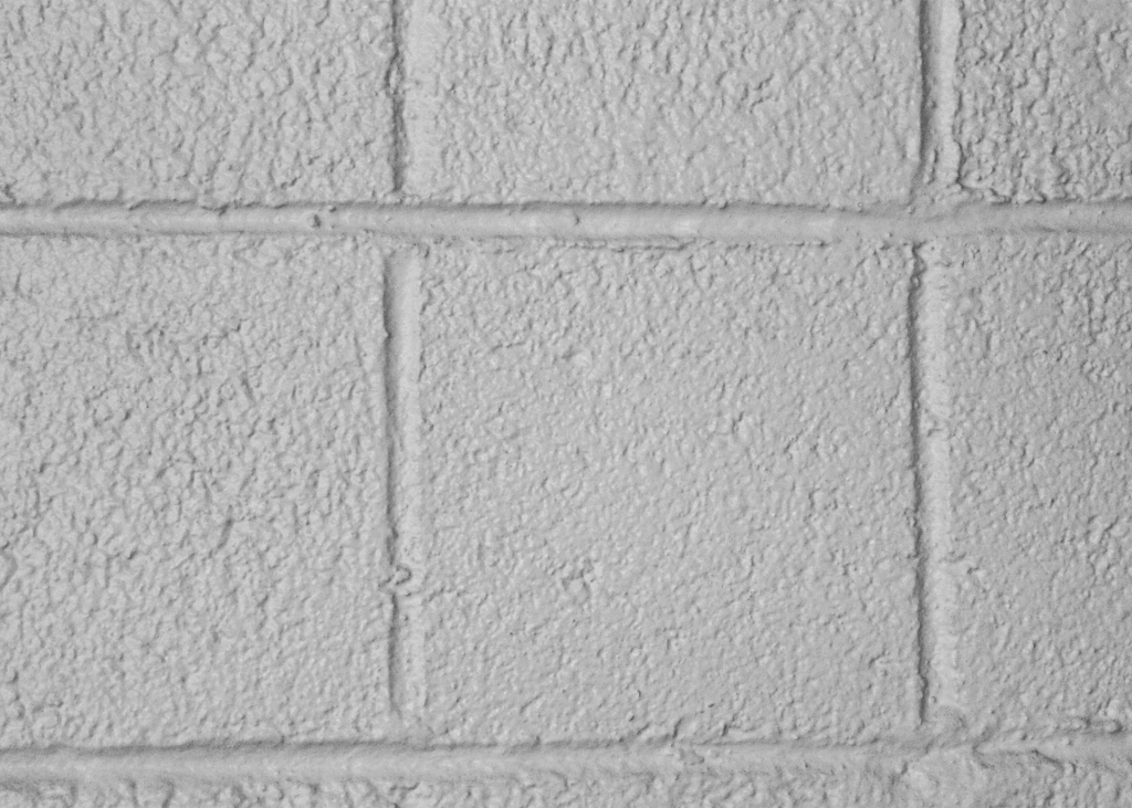
Value
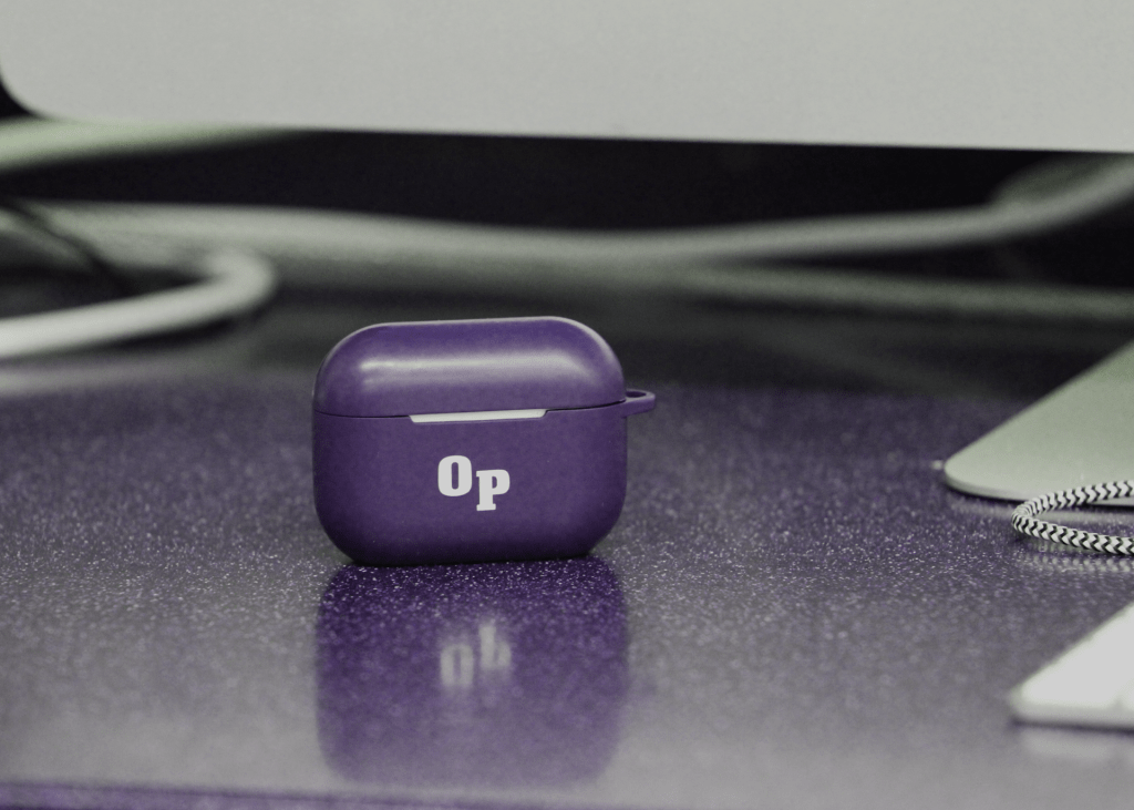
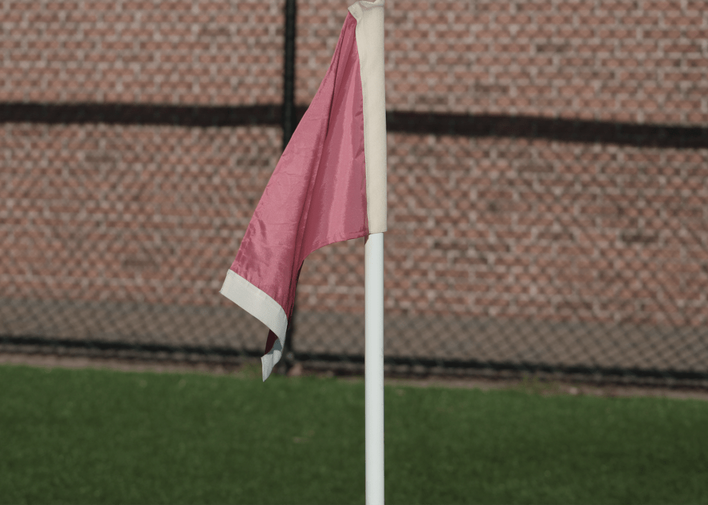
Form
Small depth of field
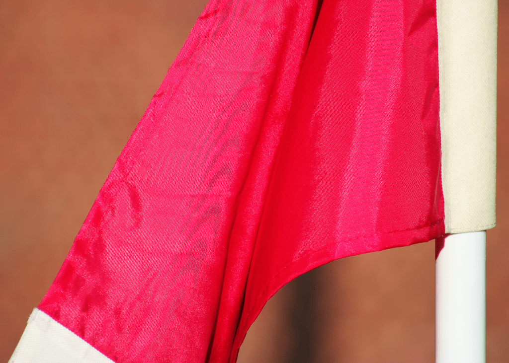
Not a lot of space, close up
Color
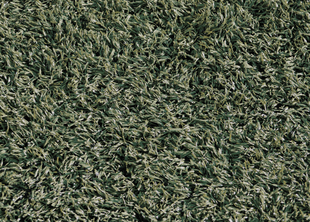
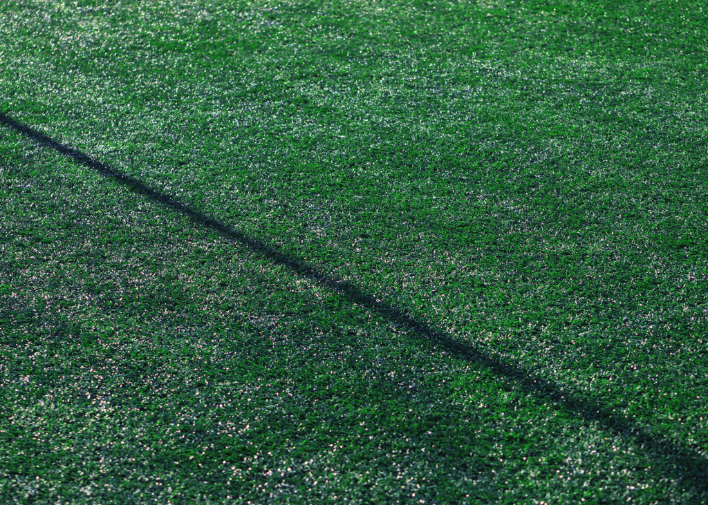
Texture
1. What strengths and weaknesses do you see in your own work?
Some strengths I see in my work is the emphasis of color and grasping the idea of the elements of art. The weakness is probably the lack of creation in a few of my photos. Another weakness could be the lack of excitement.
2. How might you improve or refine your approach in future photography projects?
I’d probably improve by watching videos on youtube. Another way is by practicing and getting my own camera working again. All it takes is more experience.
3. Pick one of your photos, what emotions or messages did you intend to convey through this photograph?
Organic shape. An emotion I tried to convey was a dark vs light emotion. In the top left you can see the light but as it goes from left to right, the mood changes and it goes rather dark.
4. Are there specific elements of art you would like to explore further in your photography?
Either texture, color or organic shape. I felt they were the easiest to do and that made it easier to come up with ideas. The 3 pics were probably the best out of the whole project.
5. What concepts or techniques do you want to experiment with in your next project?
I just want to keep growing as a photographer. I want to try getting different angles such as skewed angles. I also want to grasp more of the definition of photography more.
FINAL FULL REPLY:
Critique: Half of the photos he took were taken outside of school or taken inside when they were supposed to be taken outside. Other than this, Joe answered the questions well and his pictures followed a majority of the rubric. Joe took very sharp photos with hardly any blur or mistakes. His photoshopping was great as well, perfectly shading and adding colors to images that definitely needed them. He also focused on his images very well, not needing them to be closer or farther. The two photos that were my favorite were the organic shape because of the shadow reflecting off the banana (brightness used perfectly in this photo) and the form photo, putting all the attention to the AirPod case and showing the detail of the AirPods and table. The color picture could’ve been better because it would have been more captivating and interesting if it were a vibrant color rather than the color white. The organic shape was more interesting to look at than other pictures because it CENTERS THE PHOTO (DOMINANT EYE), bringing attention to the banana and its shadow.
I would say that my favorite 2 photos of his are his texture and value. I like the texture photo because to me it looks as if the turf grass is swaying in the wind. I also like the value photo because it makes the building look more formal and it looks nice in black and white. I would say that the color photo could be better because it is just a picture of a white wall so I would say that you can work on that. I would say that the natural line photos uses the RULES OF THIRDS. For his man made line the lines between the bricks are leading our eyes to see each other brick.